
When it comes to colors beginning with the letter C, a world of vibrant and meaningful hues opens up before us. Let’s delve into the fascinating realm of colors that start with the letter C and uncover their significance in various aspects of art, design, and culture.
First up, we have Cerulean, a captivating shade of bright blue that often brings to mind the vast expanse of the sky and the tranquil depths of the sea. Symbolizing tranquility and clarity, cerulean is a popular choice in interior design and fashion, adding a sense of calm and sophistication to any space.
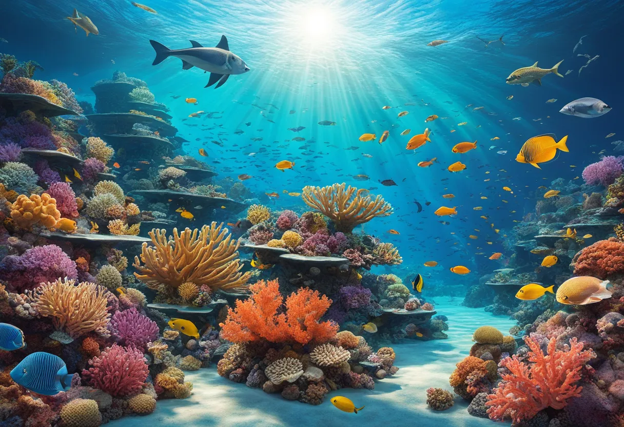
Next on our colorful journey is Coral, a warm and energetic shade of pink-orange inspired by the vibrant marine organism. Representing warmth, energy, and vitality, coral is a versatile color often seen in makeup palettes, clothing collections, and stylish home decor, injecting a pop of color and liveliness wherever it appears.
Moving on to Cyan, a refreshing greenish-blue hue that radiates a sense of calm and serenity. Widely used in digital design and printing, cyan creates a modern and soothing aesthetic, making it a popular choice for creating visually appealing graphics and artworks.
Lastly, let’s explore Chartreuse, a vibrant yellow-green color named after a French liqueur. Symbolizing growth, harmony, and freshness, chartreuse is a dynamic hue often used for highlighting and accenting in design projects, adding a touch of vibrancy and excitement to any composition.
Cerulean
Cerulean is a captivating color that evokes feelings of serenity and expansiveness. Imagine a cloudless sky on a sunny day, or the vastness of the ocean stretching out before you. This bright blue hue, often described as a mix of blue and green, brings a sense of calmness and tranquility wherever it is used.
One of the significant aspects of cerulean is its association with nature. It mirrors the clear blue skies and the deep, tranquil waters, symbolizing peace and clarity. In art and design, cerulean is frequently utilized to convey a sense of openness and freedom, making it a popular choice for creating relaxing environments.
When it comes to interior design, cerulean can brighten up a space, making it feel more airy and light. Pairing cerulean with neutral tones can create a harmonious balance, while combining it with complementary colors like white or sandy beige can enhance its refreshing qualities.
In the world of fashion, cerulean is often seen as a versatile color that can be both soothing and invigorating. It adds a pop of color to outfits, accessories, and even makeup looks, bringing a touch of the natural world into everyday life.
Overall, cerulean is a color that speaks to our innate desire for peace and tranquility. Its presence can transform any space into a serene oasis, inviting us to pause, breathe, and appreciate the beauty of the world around us.
Coral
Coral is a warm and vibrant shade that falls between pink and orange on the color spectrum. This hue derives its name from the marine organism coral, known for its vivid and lively appearance in underwater ecosystems. In the world of design and aesthetics, coral represents a blend of warmth, energy, and vitality, making it a popular choice across various industries.
When it comes to makeup, coral tones are often used to add a fresh and youthful touch to the face. The color’s lively nature can instantly brighten the complexion and create a radiant look. In fashion, coral is a versatile shade that can be incorporated into clothing and accessories to bring a pop of color to any outfit.
In home decor, coral is a favored choice for adding a touch of playfulness and charm to interior spaces. Whether used as an accent wall color, throw pillows, or decorative objects, coral can infuse a room with a sense of warmth and coziness. Its ability to evoke feelings of comfort and relaxation makes it a popular option for creating inviting living environments.
Moreover, coral is often associated with the qualities of passion, creativity, and enthusiasm. Its dynamic and energetic nature makes it a perfect choice for individuals looking to add a bold statement to their personal style or living spaces. Whether used in small doses or as a dominant color, coral has the power to uplift moods and inject a sense of liveliness into any setting.
Cyan
Cyan is a captivating color that blends the tranquility of blue with the freshness of green, creating a unique and soothing hue. This greenish-blue shade is like a cool breeze on a hot summer day, evoking feelings of calmness and serenity.
When it comes to design, cyan is a versatile color that can be both invigorating and relaxing. Its calming effect makes it a popular choice for creating a peaceful atmosphere in interior spaces. In digital design and printing, cyan is often used to add a refreshing touch, bringing a modern and vibrant feel to visuals.
Let’s explore some interesting facts about cyan:
- Cyan is a primary color in the subtractive color model, along with magenta and yellow.
- The word “cyan” is derived from the Greek word “kyanos,” which means dark blue.
- In the world of photography, cyan is one of the four colors used in the CMYK color model for printing.
Overall, cyan is a color that effortlessly combines the calming properties of blue with the rejuvenating qualities of green. Whether it’s used in art, design, or everyday objects, cyan adds a touch of tranquility and modernity to any visual composition.
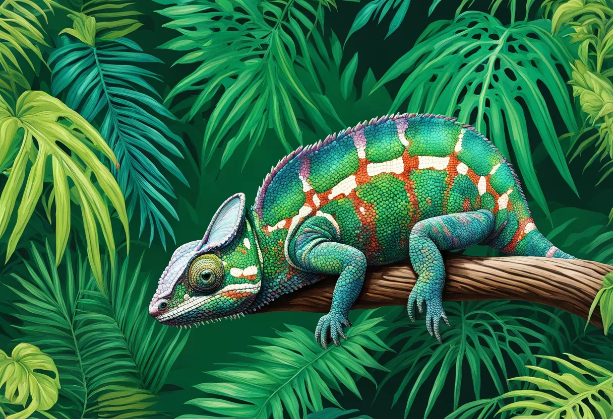
Chartreuse
Chartreuse is a vibrant yellow-green color that commands attention with its bold and lively presence. Named after the French liqueur, this hue symbolizes growth, harmony, and freshness in a way that invigorates any design it touches. Whether used sparingly as an accent or as the main focus, Chartreuse brings a sense of energy and vitality to any artistic or visual composition.
When incorporated into interior design, Chartreuse can breathe new life into a space, infusing it with a sense of renewal and rejuvenation. Its vibrant nature makes it an excellent choice for highlighting specific areas or adding a pop of color to an otherwise neutral palette.
In fashion, Chartreuse can make a bold statement, adding a touch of playfulness and sophistication to any outfit. Whether in the form of a striking accessory or a standout garment, this color has the power to elevate a look and turn heads wherever you go.
Chartreuse’s versatility extends to the world of art, where it can be used to create dynamic and visually engaging pieces. Its ability to evoke feelings of growth and harmony makes it a popular choice among artists looking to convey a sense of vibrancy and positivity in their work.
Overall, Chartreuse is a color that embodies the essence of vitality and freshness, bringing a burst of energy to any creative endeavor it graces. Its unique hue and symbolic meaning make it a valuable addition to the palette of any designer, artist, or enthusiast looking to infuse their creations with a touch of brightness and life.


